独家 | 文本数据探索性数据分析结合可视化和NLP产生见解(附代码)

作者:Susan Li
翻译:吴金笛
校对:和中华
本文约5000字,建议阅读12分钟。
本文使用电子商务的评价数据集作为实例来介绍基于文本数据特征的数据分析和可视化。
作为数据科学家或NLP专家,可视化地表示文本文档的内容是文本挖掘领域中最重要的任务之一。然而,在可视化非结构化 (文本)数据和结构化数据之间存在一些差距。

Photo credit: Pixabay
文本文档内容的可视化表示是文本挖掘领域中最重要的任务之一。作为一名数据科学家或NLP专家,我们不仅要从不同方面和不同细节层面来探索文档的内容,还要总结单个文档,显示单词和主题,检测事件,以及创建故事情节。
然而,在可视化非结构化(文本)数据和结构化数据之间存在一些差距。例如,许多文本可视化并不直接表示文本,而是表示语言模型的输出(字数、字符长度、单词序列等)。
在这篇文章中,我们将使用女装电子商务评论的数据集,并尝试使用Plotly的Python图形库和Bokeh可视化库尽可能多地探索和可视化。我们不仅将研究文本数据,而且还将可视化数值型和类别型特征。让我们开始吧!
数据
1. df = pd.read_csv('Womens Clothing E-Commerce Reviews.csv')
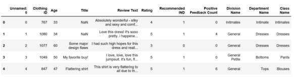
表1
经过对数据的简单检查,发现我们需要进行一系列的数据预处理。
删除“Title”特征。
删除缺少“Review Text”的行。
清洗“Review Text”列。
使用TextBlob计算位于[-1,1]范围内的情绪极性,其中1表示积极情绪,-1表示消极情绪。
为评论的长度创建新特性。
为评论的字数创建新特性。
1. df.drop('Unnamed: 0', axis=1, inplace=True)
2. df.drop('Title', axis=1, inplace=True)
3. df = df[~df['Review Text'].isnull()]
4.
5. def preprocess(ReviewText):
6. ReviewText = ReviewText.str.replace("(
7. )", "")
8. ReviewText = ReviewText.str.replace('().*()', '')
9. ReviewText = ReviewText.str.replace('(&)', '')
10. ReviewText = ReviewText.str.replace('(>)', '')
11. ReviewText = ReviewText.str.replace('(<)', '')
12. ReviewText = ReviewText.str.replace('(\xa0)', ' ')
13. return ReviewText
14. df['Review Text'] = preprocess(df['Review Text'])
15.
16. df['polarity'] = df['Review Text'].map(lambda text: TextBlob(text).sentiment.polarity)
17. df['review_len'] = df['Review Text'].astype(str).apply(len)
18. df['word_count'] = df['Review Text'].apply(lambda x: len(str(x).split()))
text_preprocessing.py
为了预览情绪极性分数是否有效,我们随机选择5个具有最高情绪极性分数(即1)的评论:
1. print('5 random reviews with the highest positive sentiment polarity: \n')
2. cl = df.loc[df.polarity == 1, ['Review Text']].sample(5).values
3. for c in cl:
4. print(c[0])
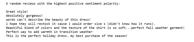
图1
然后随机选择5个具有最中性情绪级性的评论(即0):
1. print('5 random reviews with the most neutral sentiment(zero) polarity: \n')
2. cl = df.loc[df.polarity == 0, ['Review Text']].sample(5).values
3. for c in cl:
4. print(c[0])
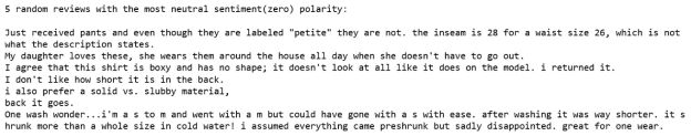
图2
只有2个评论有最负面的情绪级性分:
1. print('2 reviews with the most negative polarity: \n')
2. cl = df.loc[df.polarity == -0.97500000000000009, ['Review Text']].sample(2).values
3. for c in cl:
4. print(c[0])
图3
有效!
使用Plotly进行单变量可视化
单变量可视化是最简单的可视化类型,其仅包括对单个特征或属性的观察。 单变量可视化包括直方图,条形图和折线图。
商品评论情绪极性分数的分布
1. df['polarity'].iplot(
2. kind='hist',
3. bins=50,
4. xTitle='polarity',
5. linecolor='black',
6. yTitle='count',
7. title='Sentiment Polarity Distribution')
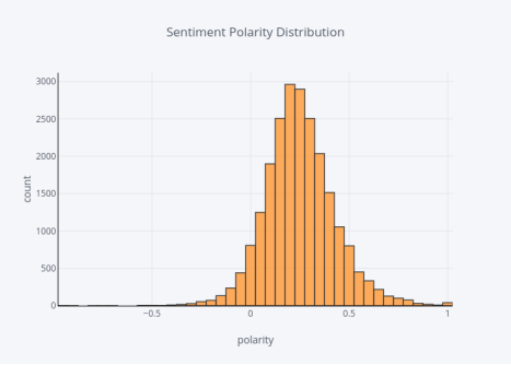
图4
绝大多数情绪极性分数大于零,意味着大多数情绪非常积极。
评论等级的分布
1. df['Rating'].iplot(
2. kind='hist',
3. xTitle='rating',
4. linecolor='black',
5. yTitle='count',
6. title='Review Rating Distribution')
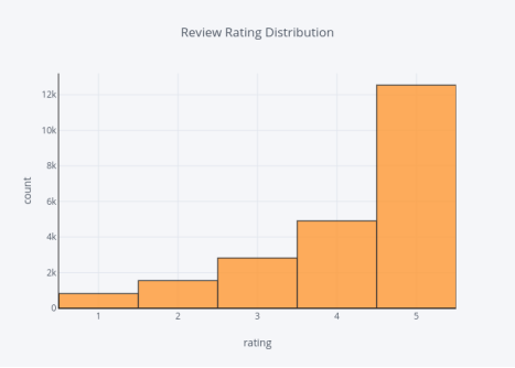
图5
等级与极性分数一致,即大多数等级都相当高,都是4或5。
评论者的年龄分布
1. df['Age'].iplot(
2. kind='hist',
3. bins=50,
4. xTitle='age',
5. linecolor='black',
6. yTitle='count',
7. title='Reviewers Age Distribution')
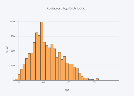
图6
大多数评论者都在30到50岁之间。
评论文本长度的分布
1. df['review_len'].iplot(
2. kind='hist',
3. bins=100,
4. xTitle='review length',
5. linecolor='black',
6. yTitle='count',
7. title='Review Text Length Distribution')
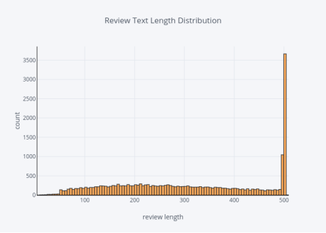
图7
评论单词数的分布
1. df['word_count'].iplot(
2. kind='hist',
3. bins=100,
4. xTitle='word count',
5. linecolor='black',
6. yTitle='count',
7. title='Review Text Word Count Distribution')
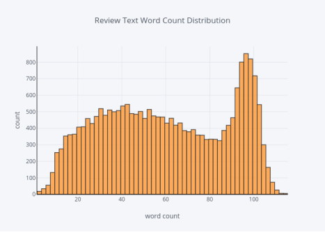
图8
有很多人喜欢留下长篇评论。
对于类别型特征,我们只需使用条形图来显示频率。
division的分布
1.df.groupby('DivisionName').count(['Clothing ID'].iplot(kind='bar', yTitle='Count', linecolor='black', opacity=0.8, title='Bar chart of Division Name', xTitle='Division Name')
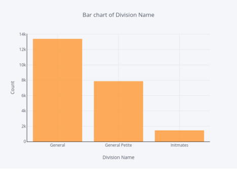
图9
General Division的评论数量最多,而Initmates division的评论数量最少。
部门的分布
1.df.groupby('DepartmentName').count(['Clothing ID'].sort_values(ascending=False).iplot(kind='bar', yTitle='Count', linecolor='black', opacity=0.8, title='Bar chart of Department Name', xTitle='Department Name')
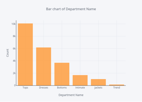
图10
当讨论部门时,Tops部门的评论最多,Trend部门的评论数量最少。
类别的分布
1..groupby('Classame').count(['Clothing ID'].sort_values(ascending=False).iplot(kind='bar', yTitle='Count', linecolor='black', opacity=0.8, title='Bar chart of Class Name', xTitle='Class Name')
图11
现在我们来看看“Review Text”特征,在探索这个特征之前,我们需要提取N-Gram特征。 N-gram用于描述用作观察点的单词的数量,例如,unigram表示单个词,bigram表示两个词的短语,而trigram表示三个词的短语。 为此,我们使用scikit-learn的CountVectorizer函数。
首先,比较在删除停用词之前和之后的unigrams会很有趣。
在删除停用词之前的top 20的unigrams分布
1. def get_top_n_words(corpus, n=None):
2. vec = CountVectorizer().fit(corpus)
3. bag_of_words = vec.transform(corpus)
4. sum_words = bag_of_words.sum(axis=0)
5. words_freq = [(word, sum_words[0, idx]) for word, idx in vec.vocabulary_.items()]
6. words_freq =sorted(words_freq, key = lambda x: x[1], reverse=True)
7. return words_freq[:n]
8. common_words = get_top_n_words(df['Review Text'], 20)
9. for word, freq in common_words:
10. print(word, freq)
11. df1 = pd.DataFrame(common_words, columns = ['ReviewText' , 'count'])
12. df1.groupby('ReviewText').sum()['count'].sort_values(ascending=False).iplot(
13. kind='bar', yTitle='Count', linecolor='black', title='Top 20 words in review before removing stop words')
top_unigram.py
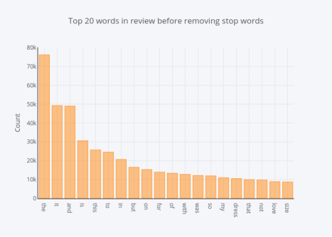
图12
在删除停用词之后的最多 unigrams的分布
1. def get_top_n_words(corpus, n=None):
2. vec = CountVectorizer(stop_words = 'english').fit(corpus)
3. bag_of_words = vec.transform(corpus)
4. sum_words = bag_of_words.sum(axis=0)
5. words_freq = [(word, sum_words[0, idx]) for word, idx in vec.vocabulary_.items()]
6. words_freq =sorted(words_freq, key = lambda x: x[1], reverse=True)
7. return words_freq[:n]
8. common_words = get_top_n_words(df['Review Text'], 20)
9. for word, freq in common_words:
10. print(word, freq)
11. df2 = pd.DataFrame(common_words, columns = ['ReviewText' , 'count'])
12. df2.groupby('ReviewText').sum()['count'].sort_values(ascending=False).iplot(
13. kind='bar', yTitle='Count', linecolor='black', title='Top 20 words in review after removing stop words')
top_unigram_no_stopwords.py
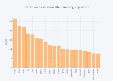
图13
第二,我们想要比较在删除停用词之前和之后的bigrams。
在删除停用词之前top20的bigrams分布
1. def get_top_n_bigram(corpus, n=None):
2. vec = CountVectorizer(ngram_range=(2, 2)).fit(corpus)
3. bag_of_words = vec.transform(corpus)
4. sum_words = bag_of_words.sum(axis=0)
5. words_freq = [(word, sum_words[0, idx]) for word, idx in vec.vocabulary_.items()]
6. words_freq =sorted(words_freq, key = lambda x: x[1], reverse=True)
7. return words_freq[:n]
8. common_words = get_top_n_bigram(df['Review Text'], 20)
9. for word, freq in common_words:
10. print(word, freq)
11. df3 = pd.DataFrame(common_words, columns = ['ReviewText' , 'count'])
12. df3.groupby('ReviewText').sum()['count'].sort_values(ascending=False).iplot(
13. kind='bar', yTitle='Count', linecolor='black', title='Top 20 bigrams in review before removing stop words')
top_bigram.py
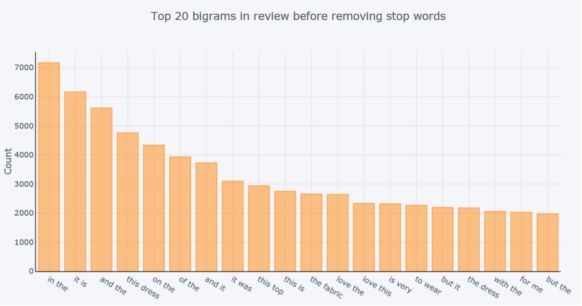
图14
在删除停用词之后top20的bigrams分布
1. def get_top_n_bigram(corpus, n=None):
2. vec = CountVectorizer(ngram_range=(2, 2), stop_words='english').fit(corpus)
3. bag_of_words = vec.transform(corpus)
4. sum_words = bag_of_words.sum(axis=0)
5. words_freq = [(word, sum_words[0, idx]) for word, idx in vec.vocabulary_.items()]
6. words_freq =sorted(words_freq, key = lambda x: x[1], reverse=True)
7. return words_freq[:n]
8. common_words = get_top_n_bigram(df['Review Text'], 20)
9. for word, freq in common_words:
10. print(word, freq)
11. df4 = pd.DataFrame(common_words, columns = ['ReviewText' , 'count'])
12. df4.groupby('ReviewText').sum()['count'].sort_values(ascending=False).iplot(
13. kind='bar', yTitle='Count', linecolor='black', title='Top 20 bigrams in review after removing stop words')
top_bigram_no_stopwords.py
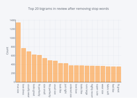
图15
最后,我们来比较在删除停用词之前和之后的trigrams。
在删除停用词之前top20的trigram分布
1. def get_top_n_trigram(corpus, n=None):
2. vec = CountVectorizer(ngram_range=(3, 3)).fit(corpus)
3. bag_of_words = vec.transform(corpus)
4. sum_words = bag_of_words.sum(axis=0)
5. words_freq = [(word, sum_words[0, idx]) for word, idx in vec.vocabulary_.items()]
6. words_freq =sorted(words_freq, key = lambda x: x[1], reverse=True)
7. return words_freq[:n]
8. common_words = get_top_n_trigram(df['Review Text'], 20)
9. for word, freq in common_words:
10. print(word, freq)
11. df5 = pd.DataFrame(common_words, columns = ['ReviewText' , 'count'])
12. df5.groupby('ReviewText').sum()['count'].sort_values(ascending=False).iplot(
13. kind='bar', yTitle='Count', linecolor='black', title='Top 20 trigrams in review before removing stop words')
top_trigram.py
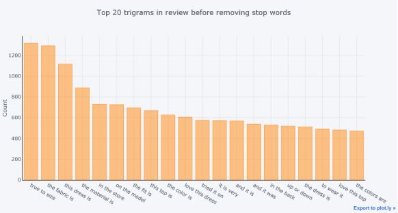
图16
在删除停用词之后top20的trigrams分布
1. def get_top_n_trigram(corpus, n=None):
2. vec = CountVectorizer(ngram_range=(3, 3), stop_words='english').fit(corpus)
3. bag_of_words = vec.transform(corpus)
4. sum_words = bag_of_words.sum(axis=0)
5. words_freq = [(word, sum_words[0, idx]) for word, idx in vec.vocabulary_.items()]
6. words_freq =sorted(words_freq, key = lambda x: x[1], reverse=True)
7. return words_freq[:n]
8. common_words = get_top_n_trigram(df['Review Text'], 20)
9. for word, freq in common_words:
10. print(word, freq)
11. df6 = pd.DataFrame(common_words, columns = ['ReviewText' , 'count'])
12. df6.groupby('ReviewText').sum()['count'].sort_values(ascending=False).iplot(
13. kind='bar', yTitle='Count', linecolor='black', title='Top 20 trigrams in review after removing stop words')
top_trigram_no_stopwords.py
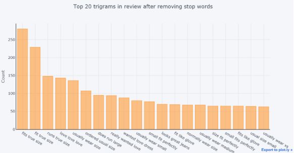
图17
词性标注(POS)是为每个单词分配词性的过程,例如名词,动词,形容词等。
我们使用简单的TextBlob API深入了解我们数据集中“Review Text”特征的POS,并可视化这些标签。
评论语料库的最多词性标签的分布
1. blob = TextBlob(str(df['Review Text']))
2. pos_df = pd.DataFrame(blob.tags, columns = ['word' , 'pos'])
3. pos_df = pos_df.pos.value_counts()[:20]
4. pos_df.iplot(
5. kind='bar',
6. xTitle='POS',
7. yTitle='count',
8. title='Top 20 Part-of-speech tagging for review corpus')
POS.py
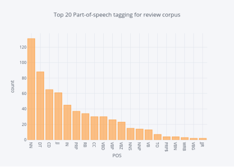
图18
箱形图用于比较电子商务商店的每个部门的情绪极性分数,评级,评论文本长度。
各部门反映了怎样的情绪极性
1. y0 = df.loc[df['Department Name'] == 'Tops']['polarity']
2. y1 = df.loc[df['Department Name'] == 'Dresses']['polarity']
3. y2 = df.loc[df['Department Name'] == 'Bottoms']['polarity']
4. y3 = df.loc[df['Department Name'] == 'Intimate']['polarity']
5. y4 = df.loc[df['Department Name'] == 'Jackets']['polarity']
6. y5 = df.loc[df['Department Name'] == 'Trend']['polarity']
7.
8. trace0 = go.Box(
9. y=y0,
10. name = 'Tops',
11. marker = dict(
12. color = 'rgb(214, 12, 140)',
13. )
14. )
15. trace1 = go.Box(
16. y=y1,
17. name = 'Dresses',
18. marker = dict(
19. color = 'rgb(0, 128, 128)',
20. )
21. )
22. trace2 = go.Box(
23. y=y2,
24. name = 'Bottoms',
25. marker = dict(
26. color = 'rgb(10, 140, 208)',
27. )
28. )
29. trace3 = go.Box(
30. y=y3,
31. name = 'Intimate',
32. marker = dict(
33. color = 'rgb(12, 102, 14)',
34. )
35. )
36. trace4 = go.Box(
37. y=y4,
38. name = 'Jackets',
39. marker = dict(
40. color = 'rgb(10, 0, 100)',
41. )
42. )
43. trace5 = go.Box(
44. y=y5,
45. name = 'Trend',
46. marker = dict(
47. color = 'rgb(100, 0, 10)',
48. )
49. )
50. data = [trace0, trace1, trace2, trace3, trace4, trace5]
51. layout = go.Layout(
52. title = "Sentiment Polarity Boxplot of Department Name"
53. )
54.
55. fig = go.Figure(data=data,layout=layout)
56. iplot(fig, filename = "Sentiment Polarity Boxplot of Department Name")
department_polarity.py
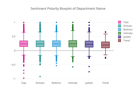
图19
除Trend部门外,所有六个部门均包含最高情绪极性评分,Tops部门具有最低情绪极性评分。 Trend部门的极性得分中位数最低。 如果您还记得,Trend部门的评论数量最少。这就解释了为什么它没有其他部门那样广泛的分数分布。
各部门反映了怎样的评级
1. y0 = df.loc[df['Department Name'] == 'Tops']['Rating']
2. y1 = df.loc[df['Department Name'] == 'Dresses']['Rating']
3. y2 = df.loc[df['Department Name'] == 'Bottoms']['Rating']
4. y3 = df.loc[df['Department Name'] == 'Intimate']['Rating']
5. y4 = df.loc[df['Department Name'] == 'Jackets']['Rating']
6. y5 = df.loc[df['Department Name'] == 'Trend']['Rating']
7.
8. trace0 = go.Box(
9. y=y0,
10. name = 'Tops',
11. marker = dict(
12. color = 'rgb(214, 12, 140)',
13. )
14. )
15. trace1 = go.Box(
16. y=y1,
17. name = 'Dresses',
18. marker = dict(
19. color = 'rgb(0, 128, 128)',
20. )
21. )
22. trace2 = go.Box(
23. y=y2,
24. name = 'Bottoms',
25. marker = dict(
26. color = 'rgb(10, 140, 208)',
27. )
28. )
29. trace3 = go.Box(
30. y=y3,
31. name = 'Intimate',
32. marker = dict(
33. color = 'rgb(12, 102, 14)',
34. )
35. )
36. trace4 = go.Box(
37. y=y4,
38. name = 'Jackets',
39. marker = dict(
40. color = 'rgb(10, 0, 100)',
41. )
42. )
43. trace5 = go.Box(
44. y=y5,
45. name = 'Trend',
46. marker = dict(
47. color = 'rgb(100, 0, 10)',
48. )
49. )
50. data = [trace0, trace1, trace2, trace3, trace4, trace5]
51. layout = go.Layout(
52. title = "Rating Boxplot of Department Name"
53. )
54.
55. fig = go.Figure(data=data,layout=layout)
56. iplot(fig, filename = "Rating Boxplot of Department Name")
rating_division.py
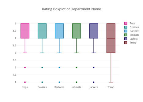
图20
除了Trend部门,所有其他部门的等级中位数均为5。总体而言,该评价数据集的评级很高且情绪积极。
各个部门的评论长度
1. y0 = df.loc[df['Department Name'] == 'Tops']['review_len']
2. y1 = df.loc[df['Department Name'] == 'Dresses']['review_len']
3. y2 = df.loc[df['Department Name'] == 'Bottoms']['review_len']
4. y3 = df.loc[df['Department Name'] == 'Intimate']['review_len']
5. y4 = df.loc[df['Department Name'] == 'Jackets']['review_len']
6. y5 = df.loc[df['Department Name'] == 'Trend']['review_len']
7.
8. trace0 = go.Box(
9. y=y0,
10. name = 'Tops',
11. marker = dict(
12. color = 'rgb(214, 12, 140)',
13. )
14. )
15. trace1 = go.Box(
16. y=y1,
17. name = 'Dresses',
18. marker = dict(
19. color = 'rgb(0, 128, 128)',
20. )
21. )
22. trace2 = go.Box(
23. y=y2,
24. name = 'Bottoms',
25. marker = dict(
26. color = 'rgb(10, 140, 208)',
27. )
28. )
29. trace3 = go.Box(
30. y=y3,
31. name = 'Intimate',
32. marker = dict(
33. color = 'rgb(12, 102, 14)',
34. )
35. )
36. trace4 = go.Box(
37. y=y4,
38. name = 'Jackets',
39. marker = dict(
40. color = 'rgb(10, 0, 100)',
41. )
42. )
43. trace5 = go.Box(
44. y=y5,
45. name = 'Trend',
46. marker = dict(
47. color = 'rgb(100, 0, 10)',
48. )
49. )
50. data = [trace0, trace1, trace2, trace3, trace4, trace5]
51. layout = go.Layout(
52. title = "Review length Boxplot of Department Name"
53. )
54.
55. fig = go.Figure(data=data,layout=layout)
56. iplot(fig, filename = "Review Length Boxplot of Department Name")
length_department.py
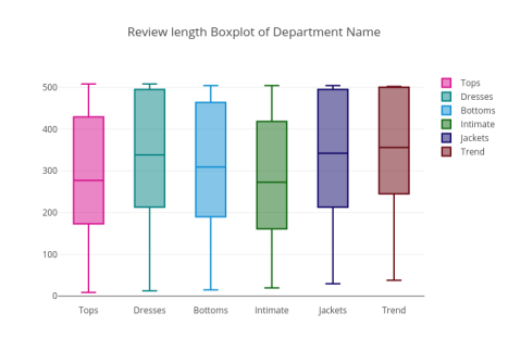
图21
相比于其他部门的评论长度,Tops和Intimate部门的评论长度的中位数相对较小。
使用Plotly进行双变量可视化
双变量可视化是一种同时包含两个特征的可视化类型。它描述了两个特征之间的关联或关系。
根据是否推荐对比情绪极性得分分布。
1. x1 = df.loc[df['Recommended IND'] == 1, 'polarity']
2. x0 = df.loc[df['Recommended IND'] == 0, 'polarity']
3.
4. trace1 = go.Histogram(
5. x=x0, name='Not recommended',
6. opacity=0.75
7. )
8. trace2 = go.Histogram(
9. x=x1, name = 'Recommended',
10. opacity=0.75
11. )
12.
13. data = [trace1, trace2]
14. layout = go.Layout(barmode='overlay', title='Distribution of Sentiment polarity of reviews based on Recommendation')
15. fig = go.Figure(data=data, layout=layout)
16.
17. iplot(fig, filename='overlaid histogram')
polarity_recommendation.py

图22
显然,具有较高的极性分数的评价更有可能被推荐。
根据是否推荐对比等级的分布
1. x1 = df.loc[df['Recommended IND'] == 1, 'Rating']
2. x0 = df.loc[df['Recommended IND'] == 0, 'Rating']
3.
4. trace1 = go.Histogram(
5. x=x0, name='Not recommended',
6. opacity=0.75
7. )
8. trace2 = go.Histogram(
9. x=x1, name = 'Recommended',
10. opacity=0.75
11. )
12.
13. data = [trace1, trace2]
14. layout = go.Layout(barmode='overlay', title='Distribution of Sentiment polarity of reviews based on Recommendation')
15. fig = go.Figure(data=data, layout=layout)
16.
17. iplot(fig, filename='overlaid histogram')
rating_recommendation.py
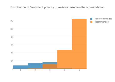
图23
推荐评论的等级比不推荐的评论更高。
根据是否推荐对比评论长度的分布
1. x1 = df.loc[df['Recommended IND'] == 1, 'review_len']
2. x0 = df.loc[df['Recommended IND'] == 0, 'review_len']
3.
4. trace1 = go.Histogram(
5. x=x0, name='Not recommended',
6. opacity=0.75
7. )
8. trace2 = go.Histogram(
9. x=x1, name = 'Recommended',
10. opacity=0.75
11. )
12.
13. data = [trace1, trace2]
14. layout = go.Layout(barmode = 'group', title='Distribution of Review Lengths Based on Recommendation')
15. fig = go.Figure(data=data, layout=layout)
16.
17. iplot(fig, filename='stacked histogram')
review_length_recommend.py
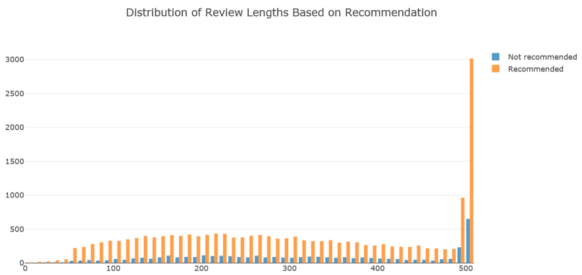
图24
推荐的评论往往比不推荐的评论要长。
情绪极性与等级的二维密度联合图
1. trace1 = go.Scatter(
2. x=df['polarity'], y=df['Rating'], mode='markers', name='points',
3. marker=dict(color='rgb(102,0,0)', size=2, opacity=0.4)
4. )
5. trace2 = go.Histogram2dContour(
6. x=df['polarity'], y=df['Rating'], name='density', ncontours=20,
7. colorscale='Hot', reversescale=True, showscale=False
8. )
9. trace3 = go.Histogram(
10. x=df['polarity'], name='Sentiment polarity density',
11. marker=dict(color='rgb(102,0,0)'),
12. yaxis='y2'
13. )
14. trace4 = go.Histogram(
15. y=df['Rating'], name='Rating density', marker=dict(color='rgb(102,0,0)'),
16. xaxis='x2'
17. )
18. data = [trace1, trace2, trace3, trace4]
19.
20. layout = go.Layout(
21. showlegend=False,
22. autosize=False,
23. width=600,
24. height=550,
25. xaxis=dict(
26. domain=[0, 0.85],
27. showgrid=False,
28. zeroline=False
29. ),
30. yaxis=dict(
31. domain=[0, 0.85],
32. showgrid=False,
33. zeroline=False
34. ),
35. margin=dict(
36. t=50
37. ),
38. hovermode='closest',
39. bargap=0,
40. xaxis2=dict(
41. domain=[0.85, 1],
42. showgrid=False,
43. zeroline=False
44. ),
45. yaxis2=dict(
46. domain=[0.85, 1],
47. showgrid=False,
48. zeroline=False
49. )
50. )
51.
52. fig = go.Figure(data=data, layout=layout)
53. iplot(fig, filename='2dhistogram-2d-density-plot-subplots')
sentiment_polarity_rating.py
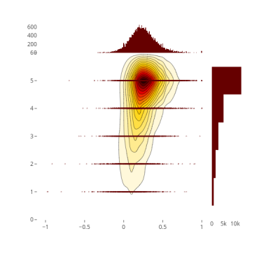
图25
年龄和情绪极性的2D密度联合图
1. trace1 = go.Scatter(
2. x=df['Age'], y=df['polarity'], mode='markers', name='points',
3. marker=dict(color='rgb(102,0,0)', size=2, opacity=0.4)
4. )
5. trace2 = go.Histogram2dContour(
6. x=df['Age'], y=df['polarity'], name='density', ncontours=20,
7. colorscale='Hot', reversescale=True, showscale=False
8. )
9. trace3 = go.Histogram(
10. x=df['Age'], name='Age density',
11. marker=dict(color='rgb(102,0,0)'),
12. yaxis='y2'
13. )
14. trace4 = go.Histogram(
15. y=df['polarity'], name='Sentiment Polarity density', marker=dict(color='rgb(102,0,0)'),
16. xaxis='x2'
17. )
18. data = [trace1, trace2, trace3, trace4]
19.
20. layout = go.Layout(
21. showlegend=False,
22. autosize=False,
23. width=600,
24. height=550,
25. xaxis=dict(
26. domain=[0, 0.85],
27. showgrid=False,
28. zeroline=False
29. ),
30. yaxis=dict(
31. domain=[0, 0.85],
32. showgrid=False,
33. zeroline=False
34. ),
35. margin=dict(
36. t=50
37. ),
38. hovermode='closest',
39. bargap=0,
40. xaxis2=dict(
41. domain=[0.85, 1],
42. showgrid=False,
43. zeroline=False
44. ),
45. yaxis2=dict(
46. domain=[0.85, 1],
47. showgrid=False,
48. zeroline=False
49. )
50. )
51.
52. fig = go.Figure(data=data, layout=layout)
53. iplot(fig, filename='2dhistogram-2d-density-plot-subplots')
age_polarity.py
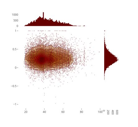
图26
很少有人非常积极或非常消极。给出中性至正面评论的人,在30多岁的可能性更大。这个年龄段的人或许也更活跃。
寻找特征术语及其关联
有时我们希望分析不同类别使用的单词,并输出一些值得注意的术语关联。我们将使用scattertext和spaCy库来实现这些。
首先,我们需要将数据帧转换为Scattertext语料库。为了查找部门名称中的差异,我们将category_col 参数设置为“Department Names
”,并使用review Text列中的评论,通过设置text_col参数进行分析。最后,将spaCy模型传递给nlp参数并调用build()来构造语料库。
下面是将评论文本与普通英语语料库区分开的术语。
1. corpus = st.CorpusFromPandas(df, category_col='Department Name', text_col='Review Text', nlp=nlp).build()
2. print(list(corpus.get_scaled_f_scores_vs_background().index[:10]))

图27
以下是与Tops部门关联最多的评论文本中的术语:
1. term_freq_df = corpus.get_term_freq_df()
2. term_freq_df['Tops Score'] = corpus.get_scaled_f_scores('Tops')
3. pprint(list(term_freq_df.sort_values(by='Tops Score', ascending=False).index[:10]))
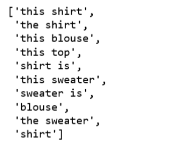
图28
以下是与Dresses部门关联最多的术语:
1. term_freq_df['Dresses Score'] = corpus.get_scaled_f_scores('Dresses')
2. pprint(list(term_freq_df.sort_values(by='Dresses Score', ascending=False).index[:10]))
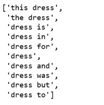
图29
主题建模评论文本
最后,我们想研究对这个数据集的主题建模算法,看看它是否会提供任何好处,是否符合我们正在为评论文本特征所做的工作。
我们将在主题建模中使用潜在语义分析(LSA)技术进行实验。
生成我们的文档-术语矩阵:从评论文本到TF-IDF特征矩阵。
LSA模型用TF-IDF分数替换文档-术语矩阵中的原始计数。
使用截断的SVD对文档-术语矩阵进行降维。
因为department的数量是6,所以我们设置n_topics=6。取此主题矩阵中每个评论文本的argmax,这将给出数据中每个评论文本的预测主题。然后,我们可以将它们分类获得每个主题的数量。
为了更好地理解每个主题,我们将找出每个主题中最常见的三个单词。
1. reindexed_data = df['Review Text']
2. tfidf_vectorizer = TfidfVectorizer(stop_words='english', use_idf=True, smooth_idf=True)
3. reindexed_data = reindexed_data.values
4. document_term_matrix = tfidf_vectorizer.fit_transform(reindexed_data)
5. n_topics = 6
6. lsa_model = TruncatedSVD(n_components=n_topics)
7. lsa_topic_matrix = lsa_model.fit_transform(document_term_matrix)
8.
9. def get_keys(topic_matrix):
10. '''''
11. returns an integer list of predicted topic
12. categories for a given topic matrix
13. '''
14. keys = topic_matrix.argmax(axis=1).tolist()
15. return keys
16.
17. def keys_to_counts(keys):
18. '''''
19. returns a tuple of topic categories and their
20. accompanying magnitudes for a given list of keys
21. '''
22. count_pairs = Counter(keys).items()
23. categories = [pair[0] for pair in count_pairs]
24. counts = [pair[1] for pair in count_pairs]
25. return (categories, counts)
26.
27. lsa_keys = get_keys(lsa_topic_matrix)
28. lsa_categories, lsa_counts = keys_to_counts(lsa_keys)
29.
30. def get_top_n_words(n, keys, document_term_matrix, tfidf_vectorizer):
31. '''''
32. returns a list of n_topic strings, where each string contains the n most common
33. words in a predicted category, in order
34. '''
35. top_word_indices = []
36. for topic in range(n_topics):
37. temp_vector_sum = 0
38. for i in range(len(keys)):
39. if keys[i] == topic:
40. temp_vector_sum += document_term_matrix[i]
41. temp_vector_sum = temp_vector_sum.toarray()
42. top_n_word_indices = np.flip(np.argsort(temp_vector_sum)[0][-n:],0)
43. top_word_indices.append(top_n_word_indices)
44. top_words = []
45. for topic in top_word_indices:
46. topic_words = []
47. for index in topic:
48. temp_word_vector = np.zeros((1,document_term_matrix.shape[1]))
49. temp_word_vector[:,index] = 1
50. the_word = tfidf_vectorizer.inverse_transform(temp_word_vector)[0][0]
51. topic_words.append(the_word.encode('ascii').decode('utf-8'))
52. top_words.append(" ".join(topic_words))
53. return top_words
54.
55. top_n_words_lsa = get_top_n_words(3, lsa_keys, document_term_matrix, tfidf_vectorizer)
56.
57. for i in range(len(top_n_words_lsa)):
58. print("Topic {}: ".format(i+1), top_n_words_lsa[i])
topic_model_LSA.py
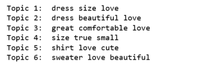
图30
1. top_3_words = get_top_n_words(3, lsa_keys, document_term_matrix, tfidf_vectorizer)
2. labels = ['Topic {}: \n'.format(i) + top_3_words[i] for i in lsa_categories]
3.
4. fig, ax = plt.subplots(figsize=(16,8))
5. ax.bar(lsa_categories, lsa_counts);
6. ax.set_xticks(lsa_categories);
7. ax.set_xticklabels(labels);
8. ax.set_ylabel('Number of review text');
9. ax.set_title('LSA topic counts');
10. plt.show();
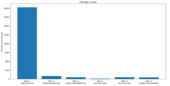
图31
通过查看每个主题中出现频率最高的单词,我们有一种感觉:可能无法在主题类别之间达到任何程度的分离。换句话说,我们不能使用主题建模技术将评论文本按部门分开。
主题建模技术有许多重要的限制。首先,“主题”这个术语有点模糊,到目前为止,很明确的是主题模型可能不会为我们的数据生成相当细致的文本分类。
此外,我们可以观察到,绝大多数的review text都被归为第一个主题(topic 0), LSA主题建模的t-SNE可视化并不会很好。
所有代码都可以在Jupyter notebook(https://github.com/susanli2016/NLP-with-Python/blob/master/EDA%20and%20visualization%20for%20Text%20Data.ipynb)上找到。
代码和交互式可视化可以在nbviewer(https://nbviewer.jupyter.org/github
/susanli2016/NLPwithPython/blob/master/
EDA%20and%20visualization%20for%
20Text%20Data.ipynb)上查看。
原文标题:
A Complete Exploratory Data Analysis and Visualization for Text Data: Combine Visualization and NLP to Generate Insights
原文链接:
https://www.kdnuggets.com/2019/05/complete-exploratory-data-analysis-visualization-text-data.html
编辑:于腾凯
校对:林亦霖
译者简介

吴金笛,雪城大学计算机科学硕士一年级在读。迎难而上是我最舒服的状态,动心忍性,曾益我所不能。我的目标是做个早睡早起的Cool Girl。
翻译组招募信息
工作内容:需要一颗细致的心,将选取好的外文文章翻译成流畅的中文。如果你是数据科学/统计学/计算机类的留学生,或在海外从事相关工作,或对自己外语水平有信心的朋友欢迎加入翻译小组。
你能得到:定期的翻译培训提高志愿者的翻译水平,提高对于数据科学前沿的认知,海外的朋友可以和国内技术应用发展保持联系,数据派THU产学研的背景为志愿者带来好的发展机遇。
其他福利:来自于名企的数据科学工作者,北大清华以及海外等名校学生他们都将成为你在翻译小组的伙伴。
点击文末“阅读原文”加入数据派团队~

点击“阅读原文”拥抱组织