Compose Material 3 稳定版现已发布 | 2022 Android 开发者峰会
作者 / Android 开发技术推广工程师 Gurupreet Singh
首个稳定版 Compose Material 3 现已发布。借助此内容库,您可以使用 Material Design 3 (新一代 Material Design) 构建 Jetpack Compose 界面。立即开始在应用中使用 Material Design 3 吧!
-
Compose Material 3 https://developer.android.google.cn/reference/kotlin/androidx/compose/material3/package-summary -
Material Design 3 https://m3.material.io/
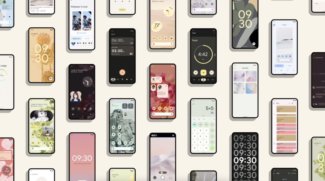
△ 多个使用 Material Design 3 主题的应用
// 在模块 build.gradle 中添加依赖项执行“androidx.compose.material3:material3:$material3_version”
https://developer.android.google.cn/jetpack/androidx/releases/compose-material3
配色方案
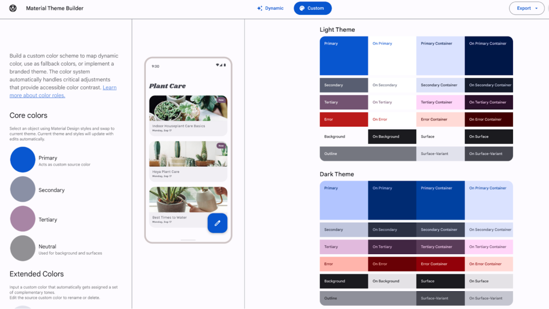
△ 用于导出 Material 3 配色方案的 Material Theme Builder
-
Material Theme Builder https://material.io/material-theme-builder -
更多关于配色方案及颜色角色的内容 https://m3.material.io/styles/color/the-color-system/key-colors-tones
动态配色
动态配色
https://m3.material.io/styles/color/dynamic-color/overview
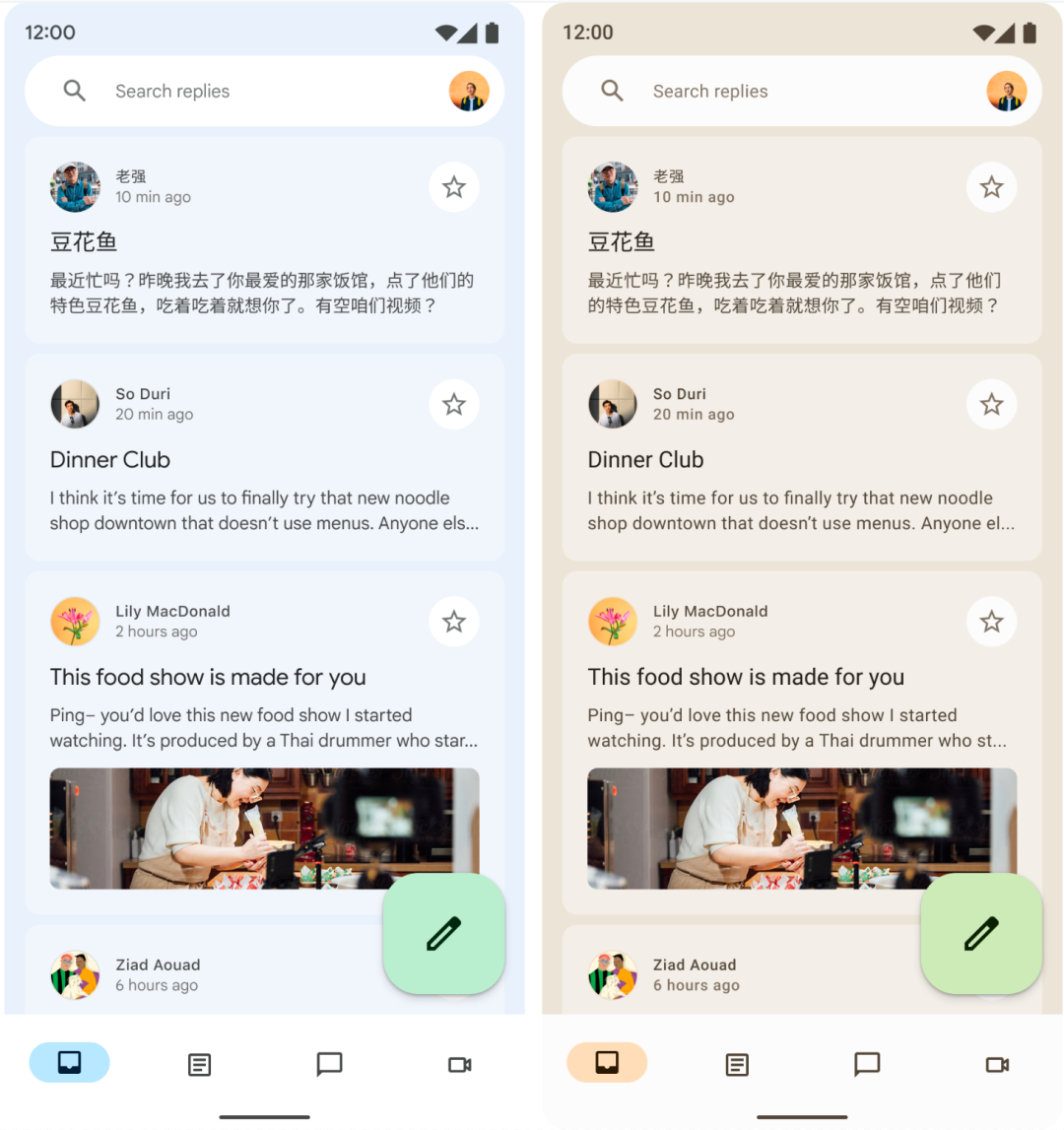
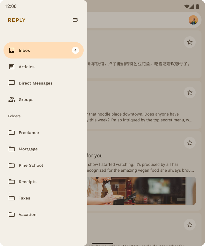
Reply 示例
https://github.com/android/compose-samples/tree/main/Reply
深色
https://developer.android.google.cn/reference/kotlin/androidx/compose/material3/package-summary#dynamiclightcolorscheme
浅色
https://developer.android.google.cn/reference/kotlin/androidx/compose/material3/package-summary#dynamicdarkcolorscheme
动态配色适用于 Android 12 及更高版本的系统val dynamicColor = Build.VERSION.SDK_INT >= Build.VERSION_CODES.Sval colorScheme = when {dynamicColor && darkTheme -> dynamicDarkColorScheme(LocalContext.current)dynamicColor && !darkTheme -> dynamicLightColorScheme(LocalContext.current)darkTheme -> darkColorScheme(...)else -> lightColorScheme(...)}MaterialTheme(colorScheme = colorScheme,typography = typography,shapes = shapes{M3 应用内容
Material 组件
Compose Material 3 API 包含大量全新和经过优化的 Material 组件,且我们计划在未来的版本中添加更多组件。许多 Material 组件 (如 Card、RadioButton 和 CheckBox) 已不再是实验性组件;这些组件的 API 十分稳定,可以在没有 ExperimentalMaterial3Api 注释的情况使用。
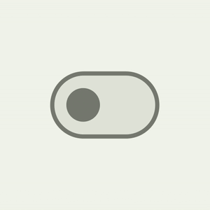
M3 Switch 组件采用全新界面,支持符合无障碍性的最小触摸目标尺寸、颜色映射,以及不同的 Switch 滑块图标选项。该界面增加了触摸目标的尺寸,同时增加了用户互动时的滑块尺寸,从而为用户提供反馈: 滑块正在与之互动。
      Switch(


            checked = isChecked,


            onCheckedChange = { /*...*/ },


            thumbContent = {


                Icon(


                    imageVector = Icons.Default.Check,


                    contentDescription = stringResource(id = R.string.switch_check)


                )


            },


        )
抽屉式导航栏组件现在提供封装容器表,以便单独更改内容的颜色、形状和高度。
| 抽屉式导航栏组件 | 内容 |
| ModalNavigationDrawer | ModalDrawerSheet |
| PermanentNavigationDrawer | PermanentDrawerSheet |
| DismissableNavigationDrawer | DismissableDrawerSheet |
△ ModalNavigationDrawer
ModalNavigationDrawer {ModalDrawerSheet(drawerShape = MaterialTheme.shapes.small,drawerContainerColor = MaterialTheme.colorScheme.primaryContainer,drawerContentColor = MaterialTheme.colorScheme.onPrimaryContainer,drawerTonalElevation = 4.dp,{{ destination ->NavigationDrawerItem(selected = selectedDestination == destination.route,onClick = { ... },icon = { ... },label = { ... })}}}
△ 包含主页和操作项的 Material CenterAlignedTopAppBar
CenterAlignedTopAppBar(title = {Text(stringResources(R.string.top_stories))},scrollBehavior = scrollBehavior,navigationIcon = { /* Navigation Icon */},actions = { /* App bar actions */})
Compose Material 3 API 参考文档概览
https://developer.android.google.cn/reference/kotlin/androidx/compose/material3/package-summary#overview
版本发布页面
https://developer.android.google.cn/jetpack/androidx/releases/compose-material3
排版
显示
-
大标题 -
小标题 -
正文 -
标签
val typography = Typography(titleLarge = TextStyle(fontWeight = FontWeight.SemiBold,fontSize = 22.sp,lineHeight = 28.sp,letterSpacing = 0.sp),titleMedium = TextStyle(fontWeight = FontWeight.SemiBold,fontSize = 16.sp,lineHeight = 24.sp,letterSpacing = 0.15.sp),...}
bodyLarge = TextStyle(fontWeight = FontWeight.Normal,fontFamily = FontFamily.SansSerif,fontStyle = FontStyle.Italic,fontSize = 16.sp,lineHeight = 24.sp,letterSpacing = 0.15.sp,baselineShift = BaselineShift.Subscript)
-
TextStyle https://developer.android.google.cn/reference/kotlin/androidx/compose/ui/text/TextStyle -
字体相关 https://developer.android.google.cn/reference/kotlin/androidx/compose/ui/text/font/package-summary
形状
Material 3 形状比例定义了容器边角的样式,提供从方形到正圆形的一系列不同角度。
超小号
小号
中号
大号
超大号
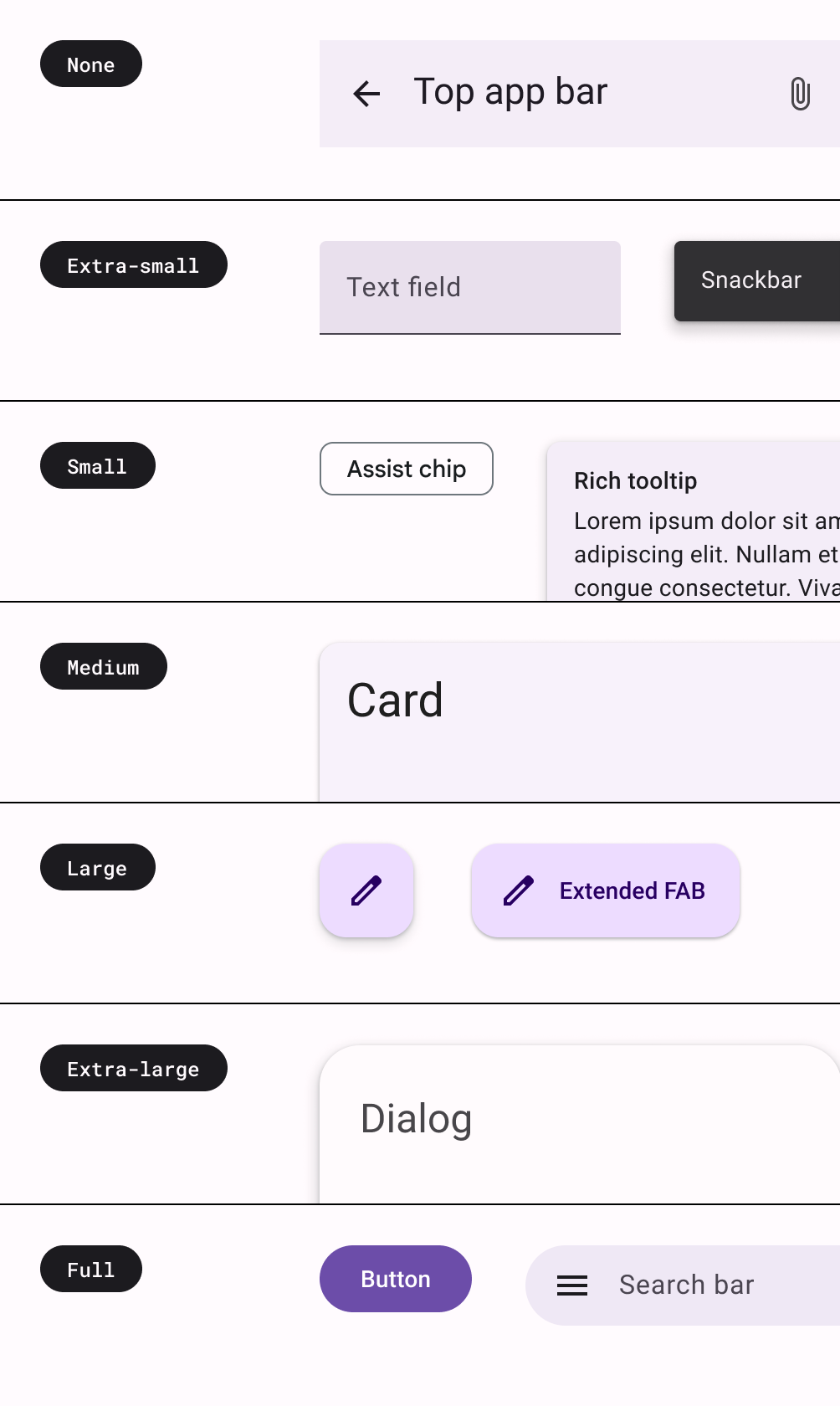
val shapes = Shapes(extraSmall = RoundedCornerShape(4.dp),small = RoundedCornerShape(8.dp),medium = RoundedCornerShape(12.dp),large = RoundedCornerShape(16.dp),extraLarge = RoundedCornerShape(28.dp))
您可以前往官方网站,阅读更多关于应用形状的内容:
窗口大小类
Jetpack Compose 和 Material 3 提供了帮助您的应用实现自适应的窗口大小工件。如需开始使用,您可以将 Compose Material 3 窗口大小类依赖项添加到您的 build.gradle 文件中:
// 在模块 build.gradle 中添加依赖项implementation "androidx.compose.material3:material3-window-size-class:$material3_version"
窗口大小类将大小划分到标准大小的存储分区中,这些存储分区是旨在针对大部分特殊情况优化应用的断点。
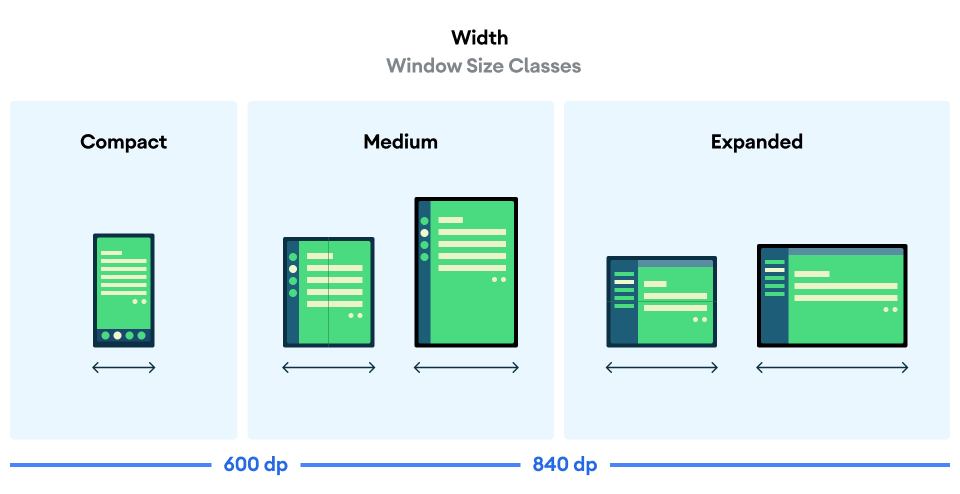
△ 用于将设备划分到不同大小的存储分区中的 WindowWidthSize 类
您可以查看 Reply Compose 示例,详细了解自适应应用和窗口大小类的实现:
窗口边衬区支持
Scaffold(contentWindowInsets = WindowInsets(16.dp)) {// Scaffold content}
资源
随着 Compose Material 3 迎来稳定版本,现在是全面了解该内容库并准备好在应用中使用的绝佳时机。您可以查看下方资源,即刻开始使用。
完整的 Material 3 和 Compose 示例 Reply:
https://github.com/android/compose-samples/tree/main/Reply -
开始将 Material 3 添加至您应用的 指南 : https://developer.android.google.cn/jetpack/compose/themes/material3 -
Material 2 升级至 Material 3 的 迁移指南 : https://developer.android.google.cn/jetpack/compose/themes/material2-material3
Jetpack Compose 示例 GitHub 代码库,您可以在其中找到各种使用 Material 3 的最新示例:
https://github.com/android/compose-samples
StackOverflow 中的 Compose 社区:
https://stackoverflow.com/questions/tagged/material-desig
-
Kotlin Slack 群组 http://slack.kotlinlang.org/
您可以在错误追踪器,将发现的问题分享给我们并追踪功能请求:
https://issuetracker.google.com/issues/new?component=742043
欢迎您持续关注我们,及时了解更多开发技术和产品更新等资讯动态。

 点击屏末 |
阅
读
原
文
| 即刻了解 Compose Material 3 更多相关内容
点击屏末 |
阅
读
原
文
| 即刻了解 Compose Material 3 更多相关内容


相关内容

Material Design Guidelines


 微信扫码咨询专知VIP会员