Python 热图进阶
【导读】如果你有一个包含许多列的数据集,快速检查列之间相关性的一种好方法是将相关矩阵可视化为热图。本文介绍了如何又快又好地画热图。
作者:Drazen Zaric
我们使用汽车数据集,它包含了多列汽车的特征。
(http://archive.ics.uci.edu/ml/datasets/automobile)
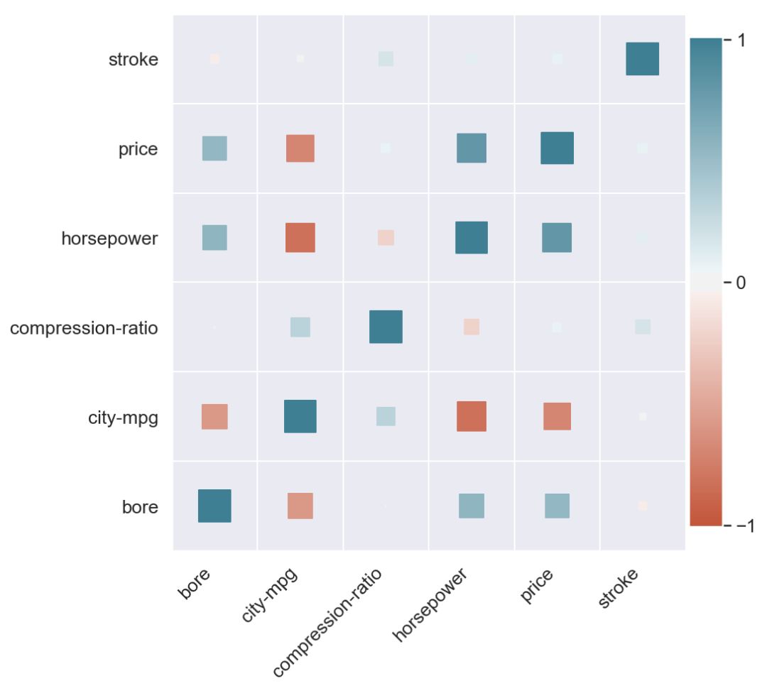
我们首先绘制该数据集的相关矩阵:
# Step 0 - Read the dataset, calculate column correlations and make a seaborn heatmapdata = pd.read_csv('https://raw.githubusercontent.com/drazenz/heatmap/master/autos.clean.csv')corr = data.corr()ax = sns.heatmap(corr,vmin=-1, vmax=1, center=0,cmap=sns.diverging_palette(20, 220, n=200),square=True)ax.set_xticklabels(ax.get_xticklabels(),rotation=45,horizontalalignment='right');
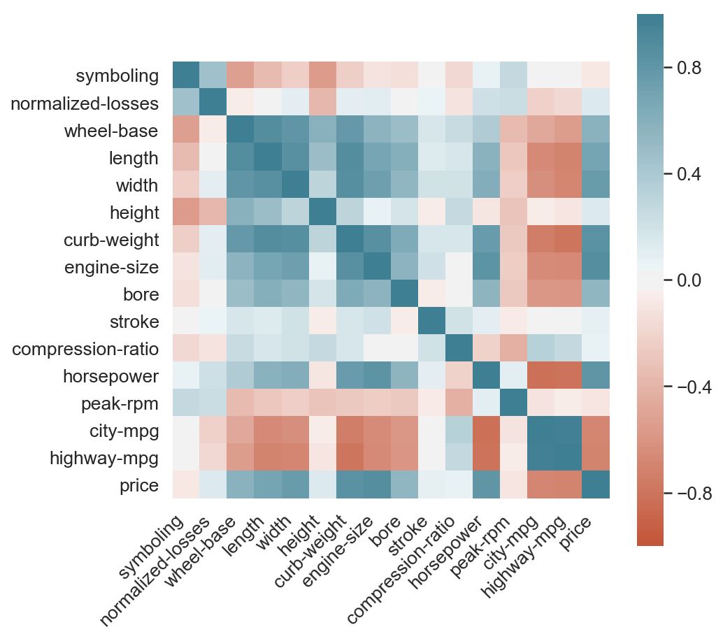
绿色表示正相关,红色表示负相关。 颜色越强,相关幅度越大。 看着上图,考虑以下问题:
当你看图表时,你的眼睛先跳到哪里?
什么是最强的,哪个是最弱的相关对(主对角线除外)?
与价格最相关的三个变量是什么?
如果你和大多数人一样,你会发现很难将色标映射到数字,反之亦然。
区分正相关和负相关是容易的,以及01.但第二个问题呢? 找到最高的负相关和正相关意味着找到最强的红色和绿色。 为此,我们需要仔细扫描整个网格。
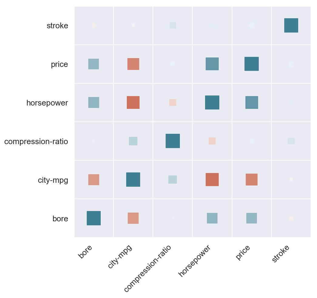
现在考虑下图:
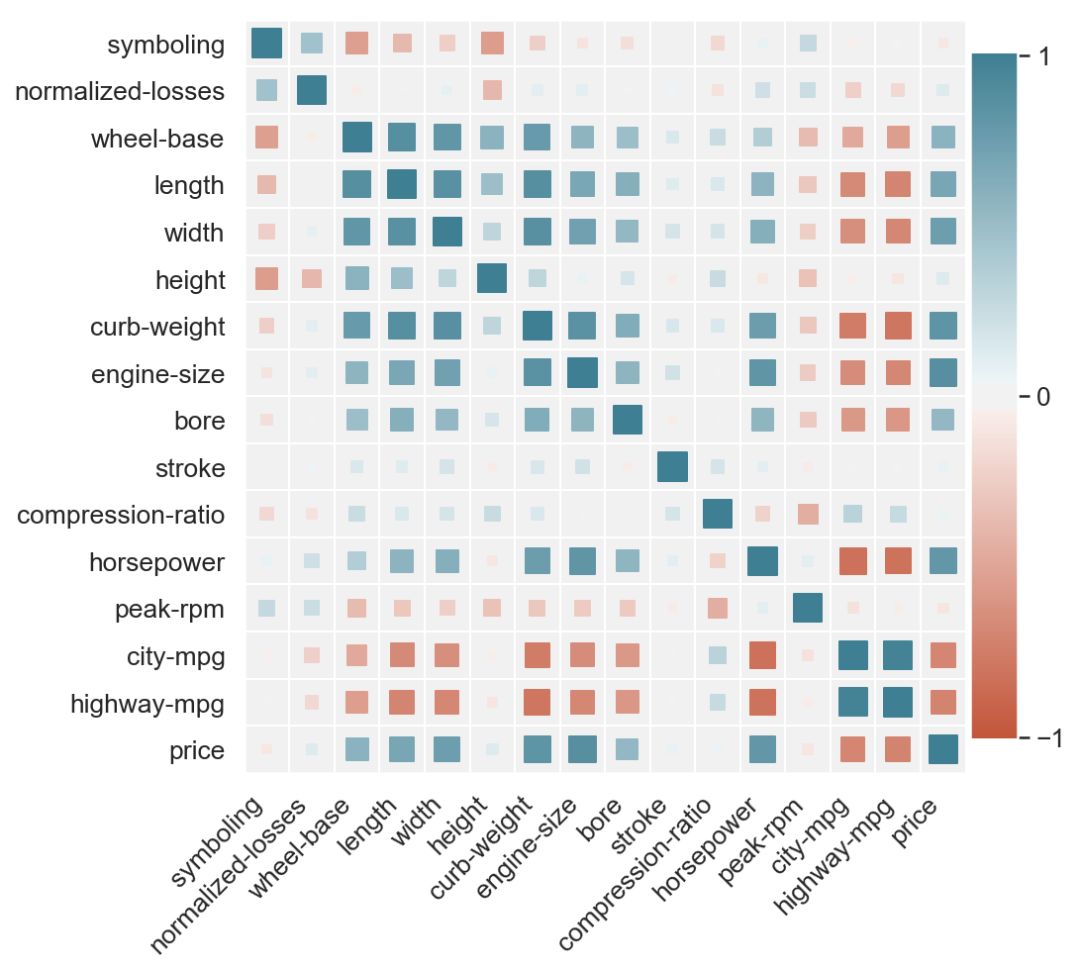
除了颜色,我们还将尺寸作为参数添加到我们的热图中。 每个方块的大小对应于它所代表的相关性的大小,即
size(c1, c2) ~ abs(corr(c1, c2))
现在尝试用后一个图解答问题。 现在可以更轻松地比较负值与正值(较浅的红色与较浅的绿色)的大小。
如果我们使用大小来表示相关度则更为自然。 这就是为什么在条形图上你会使用高度来显示度量,使用颜色来显示类别,但反之则不然。
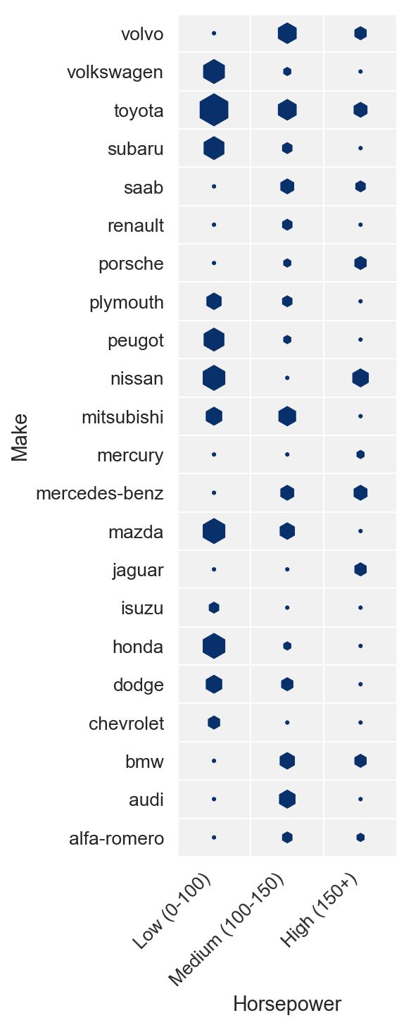
离散联合分布
让我们看看我们数据集中的汽车如何根据马力和动力传动系统布局进行分配。 也就是说,我们想要可视化下表
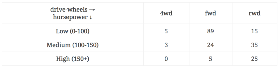
考虑以下两种方法:
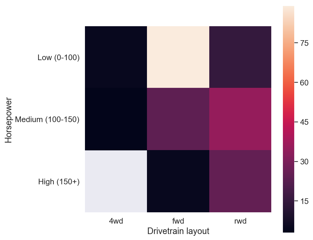
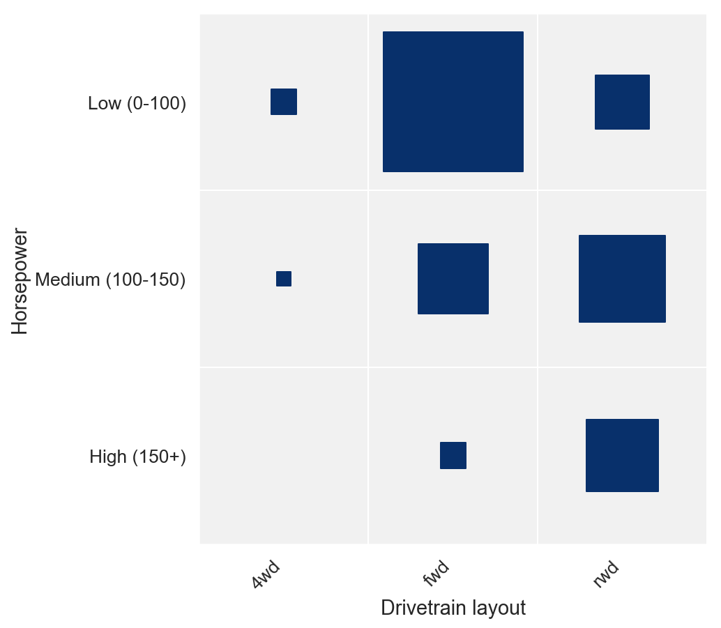
第二个版本,我们使用方形大小来显示计数,这使得无需确定哪个组是最大/最小。它还给出了一些关于边缘分布的直觉,所有这些都不需要参考颜色图例。
那么我该如何制作这些图?
为了制作常规热图,我们只使用了Seaborn热图功能,并带有一些额外的样式。
对于第二种,使用Matplotlib或Seaborn来制作它并不是一件容易的事。我们可以使用来自biokit的corrplot,但它仅对相关性有帮助,对二维分布不是很有用。
构建一个强大的参数化函数,使我们能够使用大小标记制作热图是Matplotlib的一个很好的练习。
我们首先使用一个简单的散点图,其中正方形作为标记。然后我们将修复它的一些问题,添加颜色和大小作为参数,使其对各种类型的输入更通用和鲁棒,最后制作一个包装函数corrplot,它采用DataFrame.corr方法的结果并绘制相关矩阵,为更一般的热图功能提供所有必要的参数。
这只是一个散点图
如果我们想在由两个分类轴构成的网格上绘制元素,我们可以使用散点图。
# Step 1 - Make a scatter plot with square markers, set column names as labelsdef heatmap(x, y, size): fig, ax = plt.subplots() # Mapping from column names to integer coordinates x_labels = [v for v in sorted(x.unique())] y_labels = [v for v in sorted(y.unique())] x_to_num = {p[1]:p[0] for p in enumerate(x_labels)} y_to_num = {p[1]:p[0] for p in enumerate(y_labels)} size_scale = 500 ax.scatter( x=x.map(x_to_num), # Use mapping for x y=y.map(y_to_num), # Use mapping for y s=size * size_scale, # Vector of square sizes, proportional to size parameter marker='s' # Use square as scatterplot marker ) # Show column labels on the axes ax.set_xticks([x_to_num[v] for v in x_labels]) ax.set_xticklabels(x_labels, rotation=45, horizontalalignment='right') ax.set_yticks([y_to_num[v] for v in y_labels]) ax.set_yticklabels(y_labels) data = pd.read_csv('https://raw.githubusercontent.com/drazenz/heatmap/master/autos.clean.csv')columns = ['bore', 'stroke', 'compression-ratio', 'horsepower', 'city-mpg', 'price'] corr = data[columns].corr()corr = pd.melt(corr.reset_index(), id_vars='index') # Unpivot the dataframe, so we can get pair of arrays for x and ycorr.columns = ['x', 'y', 'value']heatmap( x=corr['x'], y=corr['y'], size=corr['value'].abs())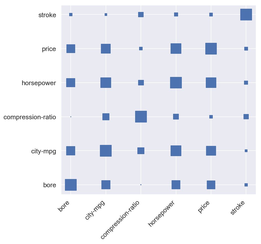
看起来我们正在做点什么。 但我说它只是一个散点图,并且前面的代码片段中发生了很多事情。
由于散点图要求x和y为数值数组,因此我们需要将列名映射到数字。 而且由于我们希望我们的轴刻度显示列名而不是这些数字,我们需要设置自定义刻度和刻度标记。 最后,代码加载数据集,选择列的子集,计算所有相关性,融合数据框(创建数据透视表的反向)并将其列提供给我们的热图功能。
你注意到我们的正方形被放置在我们的网格线相交的位置,而不是在它们的单元格中居中。 为了将方块移动到单元中心,我们将移动网格。 为了移动网格,我们实际上将关闭主要网格线,并在轴间距之间设置小网格线。
ax.grid(False, 'major')ax.grid(True, 'minor')ax.set_xticks([t + 0.5 for t in ax.get_xticks()], minor=True)ax.set_yticks([t + 0.5 for t in ax.get_yticks()], minor=True)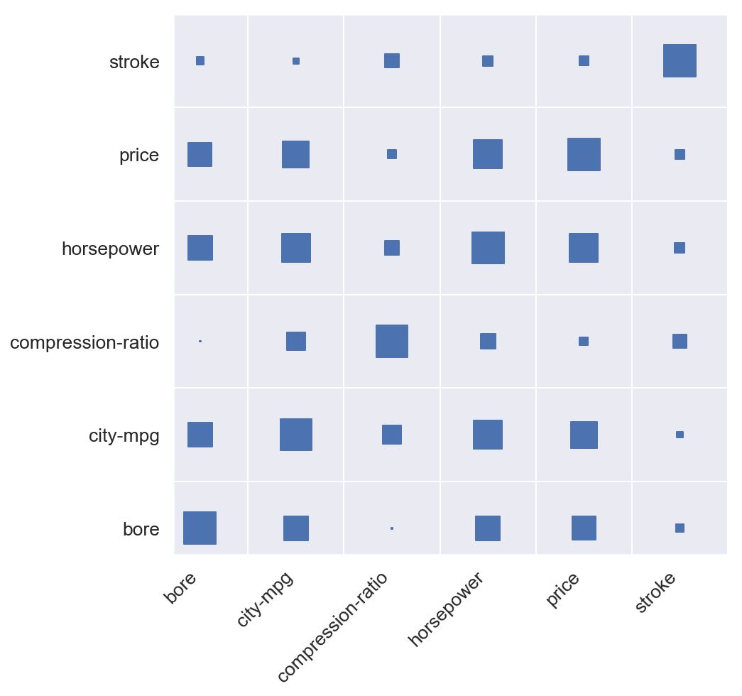
但现在左侧和底侧看起来都很紧凑。 这是因为我们的轴下限设置为0.我们将通过将两个轴的下限设置为 - 0.5来对此进行排序。 请记住,我们的点以整数坐标显示,因此我们的网格线为.5坐标。
ax.set_xlim([-0.5, max([v for v in x_to_num.values()]) + 0.5])ax.set_ylim([-0.5, max([v for v in y_to_num.values()]) + 0.5])
给它一些颜色
有趣的来了。 我们需要将相关系数的可能值范围[-1,1]映射到调色板。 我们将使用一个不同的调色板,从红色为-1,一直到绿色为1.
sns.palplot(sns.diverging_palette(220, 20, n=7))

我们首先翻转颜色的顺序,并通过在红色和绿色之间添加更多步骤使其更平滑:
palette = sns.diverging_palette(20, 220, n=256)

Seaborn调色板只是颜色组件的数组,因此为了将相关值映射到适当的颜色,我们需要最终将其映射到调色板数组中的索引。 它是一个区间到另一个区间的简单映射:[ - 1,1]→[0,1]→(0,255)。 更准确地说,这是该映射将采取的步骤序列:
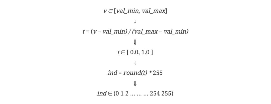
n_colors = 256 # Use 256 colors for the diverging color palettepalette = sns.diverging_palette(20, 220, n=n_colors) # Create the palettecolor_min, color_max = [-1, 1] # Range of values that will be mapped to the palette, i.e. min and max possible correlationdef value_to_color(val):val_position = float((val - color_min)) / (color_max - color_min) # position of value in the input range, relative to the length of the input rangeind = int(val_position * (n_colors - 1)) # target index in the color palettereturn palette[ind]ax.scatter(x=x.map(x_to_num),y=y.map(y_to_num),s=size * size_scale,c=color.apply(value_to_color), # Vector of square color values, mapped to color palettemarker='s')
正是我们想要的。 现在让我们在图表的右侧添加一个颜色条。 我们将使用GridSpec设置一个包含1行和n列的绘图网格。 然后我们将使用图表最右边的列显示颜色条,其余部分显示热图。
有多种方法可以显示颜色条,这里我们会用一个非常密集的条形图来欺骗我们的眼睛。 我们将绘制n_colors水平条,每条水平条都用调色板中的相应颜色着色。
plot_grid = plt.GridSpec(1, 15, hspace=0.2, wspace=0.1) # Setup a 1x15 gridax = plt.subplot(plot_grid[:,:-1]) # Use the leftmost 14 columns of the grid for the main plotax.scatter(x=x.map(x_to_num), # Use mapping for xy=y.map(y_to_num), # Use mapping for ys=size * size_scale, # Vector of square sizes, proportional to size parameterc=color.apply(value_to_color), # Vector of square colors, mapped to color palettemarker='s' # Use square as scatterplot marker)# ...# Add color legend on the right side of the plotax = plt.subplot(plot_grid[:,-1]) # Use the rightmost column of the plotcol_x = [0]*len(palette) # Fixed x coordinate for the barsbar_y=np.linspace(color_min, color_max, n_colors) # y coordinates for each of the n_colors barsbar_height = bar_y[1] - bar_y[0]ax.barh(y=bar_y,width=[5]*len(palette), # Make bars 5 units wideleft=col_x, # Make bars start at 0height=bar_height,color=palette,linewidth=0)ax.set_xlim(1, 2) # Bars are going from 0 to 5, so lets crop the plot somewhere in the middleax.grid(False) # Hide gridax.set_facecolor('white') # Make background whiteax.set_xticks([]) # Remove horizontal ticksax.set_yticks(np.linspace(min(bar_y), max(bar_y), 3)) # Show vertical ticks for min, middle and maxax.yaxis.tick_right() # Show vertical ticks on the right
我们有彩条。
我们差不多完成了。现在我们应该只是翻转垂直轴,以便我们得到每个变量与主对角线上显示的自身的相关性,使正方形稍大一点,使背景稍微轻一些,使0左右的值更加明显。
更多参数!
如果我们使函数能够接受的不仅仅是相关矩阵,那会更好的。为此,我们将进行以下更改:
能够将color_min,color_max和size_min,size_max作为参数传递,以便我们可以将不同于[-1,1]的范围映射到颜色和大小。这将使我们能够使用超出相关性的热图
如果未指定调色板,请使用顺序调色板,如果未提供颜色矢量,请使用单色调
如果未提供尺寸矢量,请使用恒定尺寸。避免将最低值映射到0大小。
使x和y成为唯一必需的参数,并将大小,颜色,size_scale,size_range,color_range,palette,marker作为kwargs传递。为每个参数提供合理的默认值
使用列表推导而不是pandas apply和map方法,因此我们可以将任何类型的数组传递为x,y,color,size而不仅仅是pandas.Series
将任何其他kwargs传递给pyplot.scatterplot函数
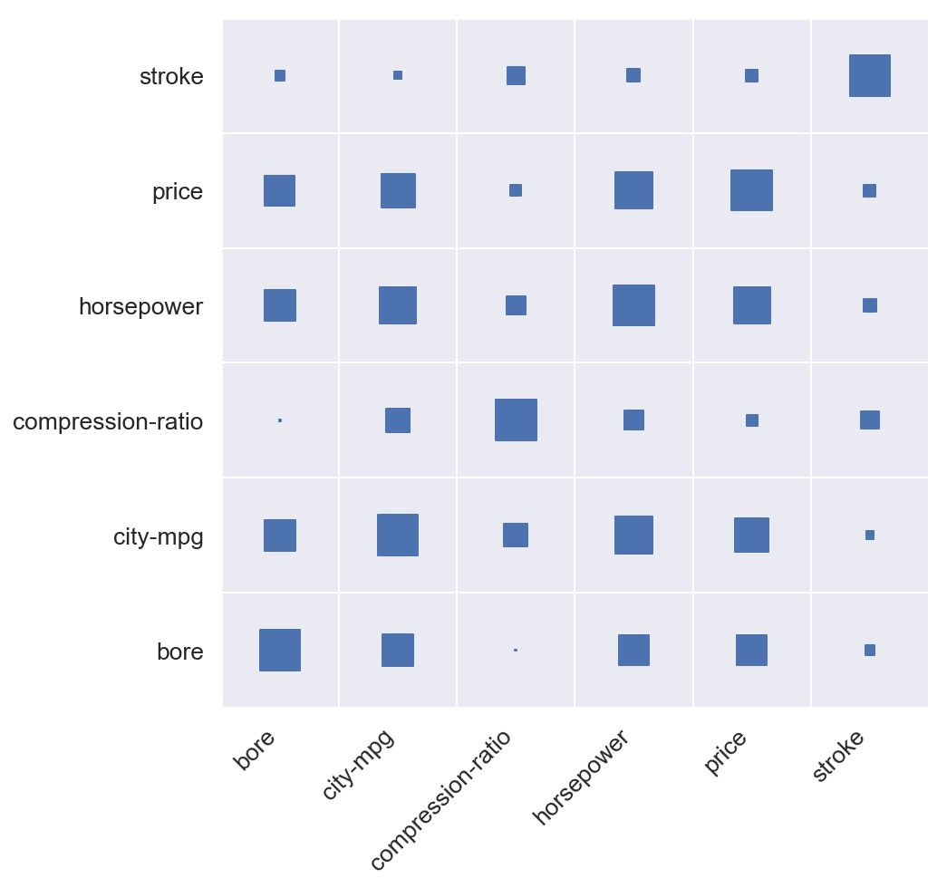
创建一个包装函数corrplot,它接受一个corr()数据帧,融化它,用红绿色分色调色板调用热图,并将size / color min-max设置为[-1,1]
现在我们有了corrplot和heatmap函数,为了创建大小正方形的相关图,就像本文开头的那个,我们只需执行以下操作:
plt.figure(figsize=(10, 10))corrplot(data.corr())
bin_labels = ['Low (0-100)', 'Medium (100-150)', 'High (150+)']data['horsepower-group'] = pd.cut(data['horsepower'],bins=[0, 100, 150, data['horsepower'].max()],labels=bin_labels)data['cnt'] = np.ones(len(data))g = data.groupby(['horsepower-group', 'make']).count()[['cnt']].reset_index().replace(np.nan, 0)plt.figure(figsize=(3, 11))heatmap(x=g['horsepower-group'],y=g['make'],size=g['cnt'],marker='h',x_order=bin_labels)
原文链接:
https://towardsdatascience.com/better-heatmaps-and-correlation-matrix-plots-in-python-41445d0f2bec
-END-
专 · 知
专知,专业可信的人工智能知识分发,让认知协作更快更好!欢迎登录www.zhuanzhi.ai,注册登录专知,获取更多AI知识资料!

欢迎微信扫一扫加入专知人工智能知识星球群,获取最新AI专业干货知识教程视频资料和与专家交流咨询!

请加专知小助手微信(扫一扫如下二维码添加),加入专知人工智能主题群,咨询技术商务合作~

专知《深度学习:算法到实战》课程全部完成!530+位同学在学习,现在报名,限时优惠!网易云课堂人工智能畅销榜首位!

点击“阅读原文”,了解报名专知《深度学习:算法到实战》课程
展开全文