微课|ggplot2:饼图
ROBLEM
今日问题
使用ggplot2绘制饼图.
为饼图添加标注.
调节绘图参数构建不同饼图.
在不同条形图下绘制饼图.
图形排版的两种方法.
构建模拟数据集df,包含五个变量sore,sex,grade,class,case. 为了在后面部分更加容易绘制饼图,又对df数据集进行了转换,构建了df1,df2,df2x和df3数据集. 大家需要注意的是我们把plyr包放在最后分开加载,这是因为tidyverse包中子包dplyr中的group_by会被plyr中的group_by覆盖,造成子数据框构建失败.
df=data.frame(score=c(11,32,46,12,19,42,31,7,34,29,27,10,                       23,41,29,7),
              sex=rep(c('M','F'),rep(8,2)),
              grade=rep(paste0('grade_',LETTERS[1:4]),rep(4,4)),
              class=rep(paste0('class_',LETTERS[1:4]),4),
              case=rep(paste0('case_',LETTERS[1:8]),2))

#加载R包
library(ggpubr)
library(tidyverse)
library(scales)
library(grid)
library(cowplot)

#数据处理

df=df%>%group_by(class)%>%mutate(scores=round(score/sum(score)*100,2))
df1=df[df$class=='class_A',]
df2=df[df$sex=='M',]
df2x=df2%>%group_by(class)%>%
  summarise(scorex=sum(score))%>%
  mutate(scorex1=round(scorex/sum(scorex)*100,2))

#加载R包
library(plyr)
df3=ddply(df2, .(case), transform, scores1 = rep(1, score/3))ggplot2中没有类似geom_xx的函数来直接产生饼图,但我们可以根据饼图自身的含义以及图层语法的思想在ggplot2中绘制饼图. 构建饼图的一般思路是,先构建条形图然后通过极坐标转换直接生成饼图,涉及的细节处理问题在后面会简要介绍.
绘制条形图
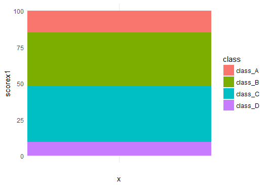
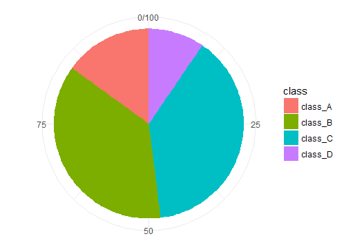
p <- ggplot(df2x,aes(x='',y=scorex1,fill=class))+
geom_bar(stat = "identity",width = 1)+theme_minimal()
p
极坐标变换
px <- p+coord_polar(theta="y", start=0)+
theme(axis.title.x = element_blank(),
      axis.title.y = element_blank()
      )
px
上面代码块中固定设置为stat = “identity”, 无聊设置为start,其他我想要说明的是width,theta这两个参数的用法. 这两个参数非常敏感,一点改变就能让你的饼图发生巨大的改变,下面分四种情况对他们进行讨论,分别是
width = 2 & theta=”y”
width = 0.2 & theta=”y”
width = 2 & theta=”x”
width = 0.2 & theta=”x”
它们分别对应下面代码块中的px1,px2,px3,px4以及图片中的A,B,C,D子图.
px1 = ggplot(df2x,aes(x='',y=scorex1,fill=class))+
  geom_bar(stat = "identity",width = 0.2)+theme_minimal()+
  scale_fill_brewer(palette = "Paired")+
  coord_polar(theta="y", start=0)+
  theme(axis.title.x = element_blank(),
        axis.title.y = element_blank()
  )
px1
px2 = ggplot(df2x,aes(x='',y=scorex1,fill=class))+
  geom_bar(stat = "identity",width = 2)+theme_minimal()+
  scale_fill_brewer(palette = "Paired")+
  coord_polar(theta="y", start=0)+
  theme(axis.title.x = element_blank(),
        axis.title.y = element_blank()
  )
px2
px3 = ggplot(df2x,aes(x='',y=scorex1,fill=class))+
  geom_bar(stat = "identity",width = 0.2)+theme_minimal()+
  scale_fill_brewer(palette = "Paired")+
  coord_polar(theta="x", start=0)+
  theme(axis.title.x = element_blank(),
        axis.title.y = element_blank()
  )
px3
px4 = ggplot(df2x,aes(x='',y=scorex1,fill=class))+
  geom_bar(stat = "identity",width = 2)+theme_minimal()+
  scale_fill_brewer(palette = "Paired")+
  coord_polar(theta="x", start=0)+
  theme(axis.title.x = element_blank(),
        axis.title.y = element_blank()
  )
px4
cowplot::plot_grid(px1, px2, px3,px4, labels = LETTERS[1:4])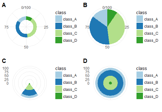
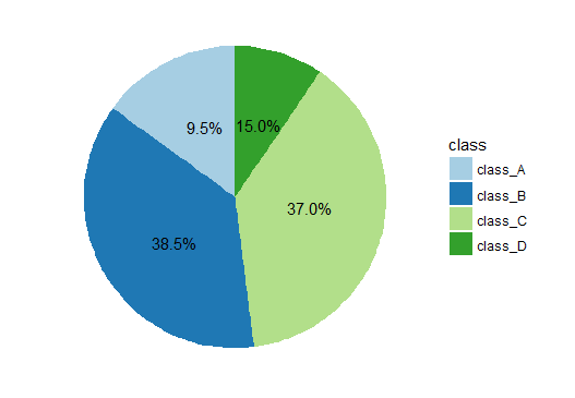
添加百分比标注最棘手的问题是标注位置的选取,建议大家不要在饼图上去寻找,这样就太盲目了. 因为我们的饼图间接画出来的,你在代码块中对位置的微调实际是针对原来的条形图的. 对原数据及直接修改会更有效,一般策略是先对把y对应的变量百分化,使用我在df2x中的方法,然后使用下面代码块中的y转换方法确定标注位置.
px+geom_text(aes(y = scorex1/3 + c(0, cumsum(scorex1)[-length(scorex1)]),
                 label = percent(scorex1/100)), size=4)+
  scale_fill_brewer(palette = "Paired")+
  theme(
    axis.text.x=element_blank(),
    panel.border = element_blank(),
    panel.grid=element_blank(),
    axis.ticks = element_blank(),
    plot.title=element_text(size=10, face="bold")
  )
我们上面只是对一种条形图进行极坐标变换绘制饼图,然后通过调节其中的某些参数绘制出不同类型的饼图。一个自然的想法是,如果初始的条形图改变了,绘制出的饼图又是什么样呢?下面我首先绘制出了9种不同的的条形图,然后通过极坐标变换生成饼图. 图形的变换多彩绝对可以惊艳到每一个人.
#定义主题
mytheme <- theme(
axis.title.x = element_blank(),
axis.title.y = element_blank(),
axis.text.x=element_blank(),
axis.text.y=element_blank(),
panel.border = element_blank(),
panel.grid=element_blank(),
axis.ticks = element_blank(),
legend.position = 'none'
)
# 绘制条形图
p1 <- ggplot(df1, aes(x="", y = scores, fill=grade)) +
geom_bar(width = 0.9, stat = "identity")+theme_minimal()+
scale_fill_brewer(palette = "Paired")+
labs(title='<p1>')+
mytheme
p1
p1s <- ggplot(df2, aes(x="", y = scores, fill=case)) +
geom_bar(width = 0.9, stat = "identity")+theme_minimal()+
scale_fill_brewer(palette = "Paired")+
labs(title='<p1s>')+
mytheme
p1s
p2 <- ggplot(df1, aes(x=grade, y = scores, fill=grade)) +
geom_bar(width = 0.9, stat = "identity")+theme_minimal() +
scale_fill_brewer(palette = "Paired")+
labs(title='<p2>')+
mytheme
p2
p2s <- ggplot(df2, aes(x=case, y = score, fill=case)) +
geom_bar(width = 0.9, stat = "identity")+theme_minimal()+
scale_fill_brewer(palette = "Paired")+
labs(title='<p2s>')+
mytheme
p2s
p2ss <- ggplot(df3, aes(x=case, y = scores1, fill=case)) +
geom_bar(width = 0.9, stat = "identity")+
geom_bar(position = "stack",width = 1,
stat = "identity", fill = NA, colour = "white")+
scale_y_continuous(breaks = seq(0,45,9))+
theme_minimal()+
scale_fill_brewer(palette = "Paired")+
labs(title='<p2ss>')+
mytheme
p2ss
p3 <- ggplot(df, aes(x=class, y = scores, fill=grade)) +
geom_bar(width = 0.9, stat = "identity",colour='white') +
theme_minimal()+
scale_fill_brewer(palette = "Paired")+
labs(title='<p3>')+
mytheme
p3
p4 <- ggplot(df, aes(x=class, y = scores, fill=grade)) +
geom_bar(width = 0.9, stat = "identity",colour='white',position=position_dodge()) +
theme_minimal()+
scale_fill_brewer(palette = "Paired")+
labs(title='<p4>')+
mytheme
p4
p5<-ggplot(df, aes(x='', y = scores,fill=grade)) +
geom_bar(width = 1, stat = "identity")+theme_light() +
facet_wrap(~class)+
scale_fill_brewer(palette = "Paired")+
labs(title='<p5>')+
mytheme
p5
p6 <- ggplot(df, aes(x=grade, y = scores, fill=grade)) +
geom_bar(width = 0.9, stat = "identity",colour='white',position=position_dodge()) +
theme_light()+
facet_wrap(~class)+
scale_fill_brewer(palette = "Paired")+
labs(title='<p6>')+
mytheme
p6
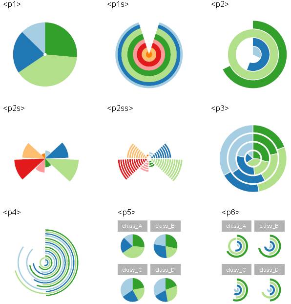
#坐标变换
p11=p1+coord_polar("y", start=0)
p11
p1s1=p1s+coord_polar()
p1s1
p21=p2+coord_polar("y", start=0)
p21
p2s1=p2s+coord_polar()
p2s1
p2ss1=p2ss+coord_polar()
p2ss1
p31=p3+coord_polar("y", start=0)
p31
p41=p4+coord_polar("y", start=0)
p41
p51=p5+coord_polar("y", start=0)
p51
p61=p6+coord_polar("y", start=0)
p61
# 图片保存
somePDFPath = "G:\\some1.pdf"pdf(file=somePDFPath)
#新建页面
grid.newpage()
#将页面分成3*3矩阵
pushViewport(viewport(layout = grid.layout(3,3)))
vplayout <- function(x,y){
viewport(layout.pos.row = x, layout.pos.col = y)
}
print(p1, vp = vplayout(1,1))
#在(1,1)的位置画图p1
print(p1s, vp = vplayout(1,2)
#将(1,2)的位置画图p1s
print(p2, vp = vplayout(1,3))
#在(1,3)的位置画图p2
print(p2s, vp = vplayout(2,1))
#在(2,1)的位置画图p2s
print(p2ss, vp = vplayout(2,2))
#在(2,2)的位置画图p2ss
print(p3, vp = vplayout(2,3))
#在(2,3)的位置画图p3
print(p4, vp = vplayout(3,1))
#在(3,1)的位置画图p4
print(p5, vp = vplayout(3,2))
#在(3,2)的位置画图p5
print(p6, vp = vplayout(3,3))
#将(3,3)的位置画图p6
grid.newpage()
#新建页面
pushViewport(viewport(layout = grid.layout(3,3)))
#将页面分成3*3矩阵
print(p11, vp = vplayout(1,1))
#在(1,1)的位置画图p11
print(p1s1, vp = vplayout(1,2))
#将(1,2)的位置画图p1s1
print(p21, vp = vplayout(1,3))
#在(1,3)的位置画图p21
print(p2s1, vp = vplayout(2,1))
#在(2,1)的位置画图p2s1
print(p2ss1, vp = vplayout(2,2))
#在(2,2)的位置画图pss1
print(p31, vp = vplayout(2,3))
#在(2,3)的位置画图p31
print(p41, vp = vplayout(3,1))
#在(3,1)的位置画图p41
print(p51, vp = vplayout(3,2))
#在(3,2)的位置画图p51
print(p61, vp = vplayout(3,3))
#将(3,3)的位置画图p61
#dev.off() ##画下一幅图,记得关闭窗口
dev.off()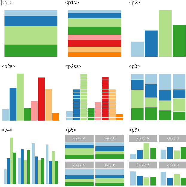
推荐阅读
Python微课 | Seaborn——Python优雅绘图(上)
更多微课请关注【数萃大数据】公众号,点击学习园地—可视化


欢迎大家关注微信公众号:数萃大数据

python大数据分析培训班【杭州站】
时间:2017年8月18日-22日
地点:杭州亚朵吴酒店
更多详情,请扫描下面二维码

网络爬虫与文本挖掘培训班【宁波站】
时间:2017年9月23日-25日
地点:维也纳国际酒店(机场店)
更多详情,请扫描下面二维码